
Olympic Games London 2012
London 2012The Brand
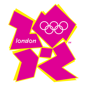
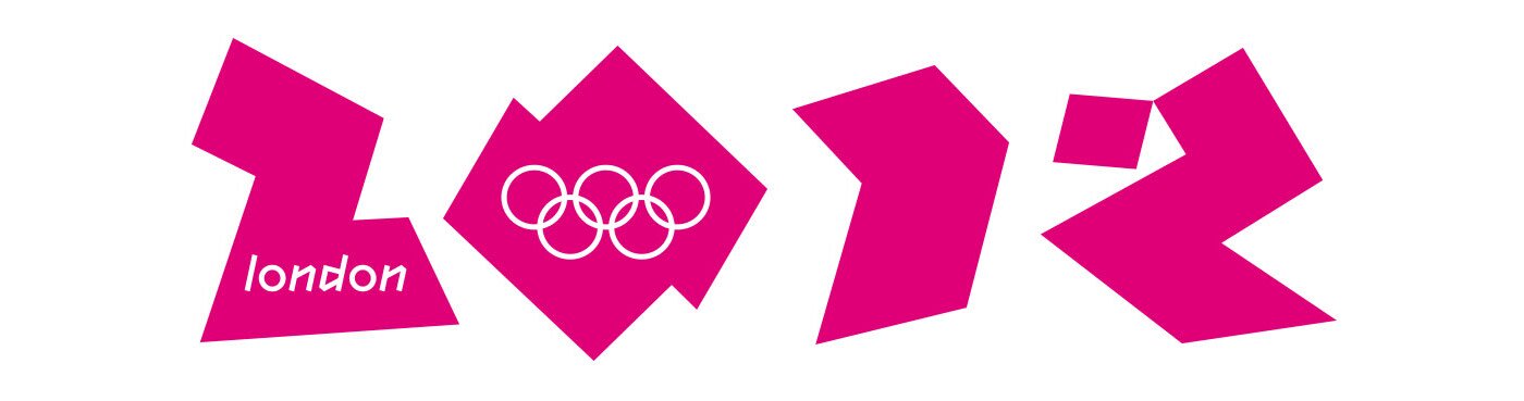
Emblem
Poster
The poster, by artist Rachel Whiteread, named "LOndOn 2012", shows circles in the Olympic colours superimposed over each other. It is a clear reference to the five rings that make up the Olympic symbol. These circles, which appear as marks made by bottles or glasses left on a table, symbolise the memory of a social meeting, such as the gathering of Olympic Games spectators or the meeting of athletes in the stadium at the Opening Ceremony.
The Organising Committee worked in collaboration with Tate and the Plus Tate Group – a group of 19 regional art galleries across the UK – to select artists responsible for creating the official posters of London 2012. Together, they established a list of over 100 artists to be considered. A jury composed of renowned experts in the arts field reduced this list to 12 individuals of whom six each designed a poster for the Olympic Games.
The jury’s main objective was artistic excellence. Three of the six individuals who designed posters for the Olympic Games, including Rachel Whiteread, had won the Turner Prize.

London 2012: An Edgy Look
In what was a first in Olympic history, the logo did not feature the city or the country, but the year: 2012. Four strong, loud colours, inspired by the worlds of media, communication and fashion.
Learn more on the virtual exhibition of the Olympic Museum.
2012
Discover the Games
The Brand
A visual identity is developed for each edition of the Olympic Games.Brand
The Medals
Beginning as an olive wreath, medal designs have evolved over the years.Medals
The Mascot
An original image, it must give concrete form to the Olympic spirit.Mascot
The Torch
An iconic part of any Olympic Games, each host offers their unique version.Torch