Automatic Settings Are Boring. Bring Mood to Your Photos With These Easy Color Adjustments.


By Phil Ryan
Phil Ryan is a writer primarily covering photography gear, printers, and scanners. He has been testing cameras professionally for 19 years.
Most cameras do a great job of capturing realistic color—you can just set everything to auto and snap away. Even if the pictures you make look a little different from what you saw in the moment, they usually still turn out close enough that you don’t give them a second thought.
But sometimes automatic isn’t the setting you really need. Sometimes you want to create a mood that reflects what you’re feeling as you press the shutter. Sometimes you want to shoot images that look as if you made them with your favorite kind of film. And sometimes the camera just doesn’t get it right. In those situations, it’s important to know how to tweak color settings to get the look you’re after.
Whether you use a point-and-shoot camera, a mirrorless camera, or a smartphone, there are settings you can use while you shoot and adjustments you can make in editing apps that can help you manifest your vision. Here are a few common scenarios, along with the tools you can use to achieve the look you want.
When the camera gets white balance wrong
Modern automatic white balance is remarkably intelligent, but even the best systems can fail. If your camera produces images that are too warm or too cool, that’s your cue to dial in a custom white balance setting—specifically, by adjusting the color temperature.
Digital cameras most often miss the mark when shooting under dim, artificial light, which can trick your camera into producing yellow-tinged, warm images. Modern mirrorless cameras and smartphones are less susceptible to the issue than older DSLRs, but it can still occur from time to time. And automatic white balance can also be fooled when you’re shooting outdoors, especially in the shade, where it might render images that are too cool.
In these cases, you can set a numerical color temperature in your camera to compensate and then shoot again. To get a clinically accurate white balance, use a gray card to set a custom white balance. Alternatively, you can shoot in raw format and use editing software to achieve the correct white balance after the fact.
Generally speaking, setting a lower color-temperature number (expressed in kelvins) in your camera or editing software produces a cooler image, while a higher number makes your photos warmer. This is the opposite of what’s indicated in the actual Kelvin scale—where a lower number is warmer and a higher number is cooler—because you’re actually using your camera’s setting to balance the color of the light it’s capturing.
When you want to create a specific mood
In both its free and paid versions, this app stands out for its huge range of adjustments and high-quality output.
Using intentionally “incorrect” color can help create an idyllic vision of what you want a scene to look like and help express what you’re feeling. Adjusting color temperature is a great way to do that.
Everyone’s feelings about color are unique, but generally speaking a lower color-temperature setting evokes a cool, wintry mood and can provoke sad, contemplative emotions. Correspondingly, a higher setting makes your pictures warmer and promotes a feeling of summery happiness and contentment. You can use these tweaks—subtly or not—to influence how other people view your images.
When you want to mimic a film look
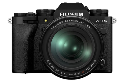
Fujifilm’s cameras are known for their color presets that mimic classic film stocks, and they offer plenty of options to adjust those looks—or create your own.
Most classic film stocks weren’t designed to accurately re-create real-world color. Instead, film manufacturers such as Kodak and Fujifilm spent oodles of money on focus groups to find out what people preferred to see. Usually, that meant colors with plenty of saturation.
These companies also created their own identity based on specific color looks, with iconic sub-brands such as Kodak Gold and Fujifilm Velvia. Kodak leaned toward warmer colors, while Fujifilm became known for its tendency to highlight the color green.
Today, digital cameras often provide image presets that evoke film-era looks. Fujifilm’s collection of presets is the most prominent of these, consisting of film simulations that offer detailed reconstructions of its own film stocks, but other companies such as Ricoh and Nikon also provide film-style settings. (Nikon-camera owners can even download user-created film profiles and load them directly onto their cameras.) Such presets can be a great jumping-off point for creative photography and offer you an easy way to evoke a nostalgic feeling in people who view your photos.
But if your camera doesn’t have such presets, you can approximate a film-like look with color controls. In addition to color temperature, these controls include tint, hue, saturation, vibrance, and white balance shift.
Tint is a setting that shifts the overall look of an image toward either green or magenta. Human eyes are sensitive to green, so you should probably tread lightly when adjusting tint, if you venture into adjusting it at all.
Hue is a setting that you should tweak only if you want to adjust the way individual colors appear. It lets you push each available color (typically red, orange, yellow, green, cyan, blue, purple, and magenta) toward one or the other end of the color spectrum.
For instance, you can make oranges look more red or more yellow, or make purples look more blue or more violet. These kinds of shifts can be confusing in areas where the color is only partially present and can make things look very unnatural, so it’s usually best to keep your adjustments subtle.
I’ve primarily used hue corrections only when the camera got the color of a shirt or another prominent subject wrong. Some colors, such as purple, can be difficult for cameras to get right even as they make everything else look correct.
Saturation and vibrance don’t affect white balance per se. Instead, they control how intense the colors in an image appear. In addition to providing global sliders that affect all colors evenly, better editing apps let you tinker with saturation and luminance (lightness or darkness) for individual colors, typically in the same place where you adjust hue.
White balance fine-tuning is a setting that you usually use in conjunction with automatic white balance, moving it on a dual-axis grid with one axis representing blue and the other red. This is different from a manual white balance setting in that it relies on automatic white balance, and any tweak you make here applies after the camera has already determined the correct automatic white balance setting.
Fujifilm calls the setting white balance shift, Sony dubs it white balance adjustments, and Olympus names it white balance compensation (PDF). Nikon doesn’t label it but offers it as a menu option when you select automatic white balance.
This fine-tuning creates a more consistent color shift across a wide variety of lighting conditions, and it’s a setting that Fujifilm’s film simulations and other brands’ film-style presets use extensively to evoke the look of specific film stock.
How to access your camera’s color settings
Smartphone cameras differ in how much control they give you over color, but typically you can select from warmer or cooler white balance settings via presets at the very least. Ultimately, it may be simpler and more effective to adjust the images after you shoot. If you want more specific control while shooting, we recommend using the camera controls built into the free version of the Adobe Lightroom app.
On an iPhone: After opening the camera app, you can tap the ^ icon at the top of the screen to access picture styles, swipe through to a preset you prefer, and adjust the tone to add or reduce contrast or warmth, changing the color temperature of that preset.
On an Android phone that uses the default Android camera app (such as a Pixel device): You can select filters for presets to add warming, cooling, or other effects and select the intensity of the filter. For more control, you can activate the camera’s Pro mode, where you can select a specific color temperature and make changes to tint or saturation. Android phones that use a third-party launcher, such as Samsung or OnePlus devices, may have different options.
On a compact or mirrorless camera: Look for color presets, which might be called Creative Styles, Film Simulations, Art Filters, or something similar (the terminology varies by brand). Usually you can customize such presets, and some cameras allow you to create your own.
These color presets typically operate independently from the camera’s white balance setting. Think of them as an added filter on top of that setting. The possibilities are nearly endless, but if you explore in small steps and act systematically, you can eventually hone your personal style—and make your photography stand out.
This article was edited by Ben Keough and Erica Ogg.
Meet your guide

Phil Ryan
Phil Ryan is Wirecutter’s senior staff writer for camera coverage. Previously, over 13 years he covered cameras and other photo-related items for CNET and Popular Photography. As the latter's tech editor and then senior tech editor, he was responsible for maintaining and refining the lab testing for cameras, and as the main camera tester, he used and wrote reviews of many of the cameras released in that timeframe.
Mentioned above
- The Sony RX100 VII is the best choice for people who want a compact camera that produces significantly better photos and video than their smartphone.The Best Point-and-Shoot Camera
- After testing dozens of cameras over the years, we can say that the Olympus OM-D E-M10 Mark IV is the best mirrorless camera for most people.The Best Mirrorless Camera
- Whether you prefer iPhones or Android, we have smartphone recommendations for every budget.The Best Smartphones
- If you wish your phone’s photos looked better, or if you just prefer editing images on your phone or tablet, Adobe Lightroom or Snapseed is the best choice.The Best Photo Editing Apps for Android and iOS
Further reading

The Best Photo Book Service
by Erin Roberts
If you want to make a photo book to commemorate an event or experience, Mixbook is the best service to use.

The Best Laptops for Video and Photo Editing
by Dave Gershgorn
Photographers and video editors on the go need a powerful laptop with good battery life, and the 16-inch MacBook Pro is almost always the best tool for the job.

How a Pro Photographer Edits iPhone Photos
by Michael Hession
A simple workflow for editing photos on a mobile device, from the perspective of a professional photographer.

The Best Holiday Photo Cards
by Erin Roberts and Ben Keough
We think that Simply to Impress is the best service for creating and sending custom, high-quality photo cards to your friends and loved ones.